
Interested in advertising on Derpibooru? Click here for information!

Help fund the $15 daily operational cost of Derpibooru - support us financially!
Source
not provided yet
Help fund the $15 daily operational cost of Derpibooru - support us financially!
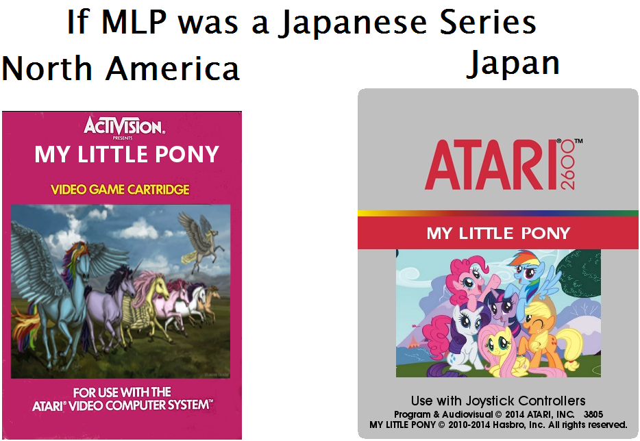
Basically, for an Activision MLP game, imagine a hand-drawn picture of a screen from Adventure Ponies, with a five-tone gradient streak behind the characters to denote motion.
As for Atari’s own box art, you’ll often find incredible paintings inspired by album and film art of the 70s. Defender in particular is strikingly beautiful.
Left is better because Derpy.
No problem. XD
Thank you!
So this is what you used it for. Well done! :3
I personaly prefer the american version.The japanese version look like something that came out of Blingee.com
The minimalist style doesn’t work all the time…but when it does…
Japan:
Europe:
America:
Ick. Our [European] Megaman 2 cover art was awful, too.
As a Mega Drive/Genesis fan, I have to add Sega Europe made some screwed-up cover art, too.
Then, Anime finally became popular in my 20’s so that problem was finally fixed.
The first Breath of Fire cartridge for the US was even more different. It looked like something out of He-Man XD
Wonder what would be the MLP equivalent?
American Ryu:
@Keith Mowz
Oh crystal clear now…
It was officially a joke, but they claim they weren’t trying to be cruel
There you have it. Surprised they went with that Megaman in particular for Street Fighter X Tekken. Probably some kind of cruel joke.
Here. Have a trope.
that’s totally not comparing two extremes
nope
You don’t know how old video games from Japan used to have entirely different artwork when distributed in the US?
Reminds me of this.