Uploaded by coolycool 

1000x1000 PNG 205 kB
Interested in advertising on Derpibooru? Click here for information!

Help fund the $15 daily operational cost of Derpibooru - support us financially!
Description
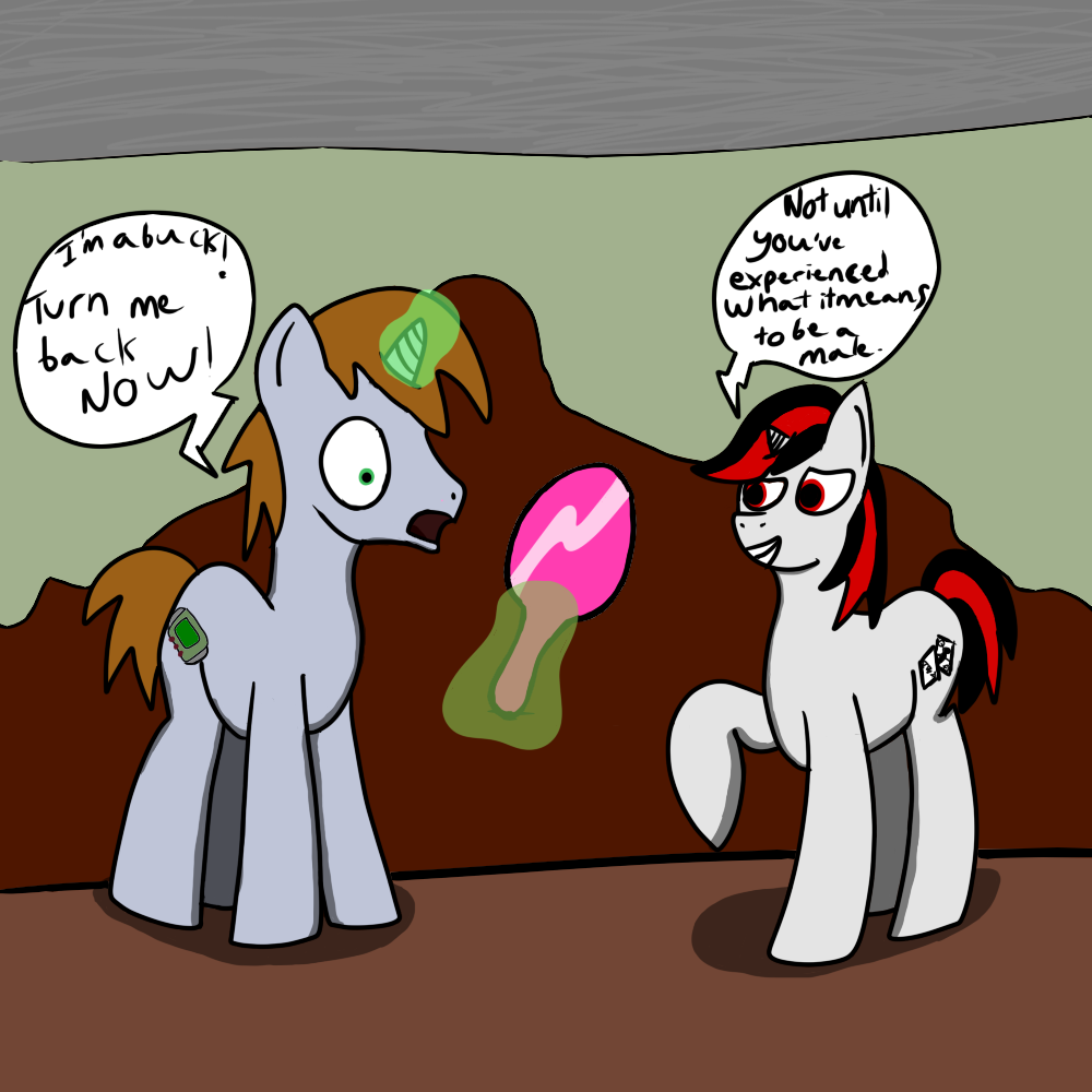
Part one of something that will involve these two.
Edited
Thanks alot. I did notice that Blackjack’s head was too small though but it was a bit too late…
And I draw the three circles the same sizes (roughly) and they don’t overlap..
Well then! Stuff to fix in my next-next drawing.. because I already started and I’m almost done with the next part.
If you’re looking for feedback then the obvious first point to make is Blackjack and Little Pip themselves. They’re very, shall we say, squiggly. And not just that the outlines aren’t smooth or anything, but they’re simply not drawn right.
The head and body proportions just aren’t right for a start. At least not for attempt to replicate the show style as far as being hand-drawn go. As I learned while learning to draw pones the circles of the body (two overlapping) are both 1/3 the size of the head, and the legs are as big as the head is wide.
As those proportions go the body and legs are both way too large for the head.
It may be crazy to suggest it too: but if you can’t yet use references right to get proportions or a stance right you could honestly try tracing to get the feel for proportions and the basic shapes down. It’s ultimately how I got the basic position and feel right for my early vectors.
I don’t think it’s really subtle…
Ohey! positive score! (and I jinxed it..)
I have to work on everything, but the ugliest thing in this has to be the shading at certain places and the background.