

Background Pony #1393
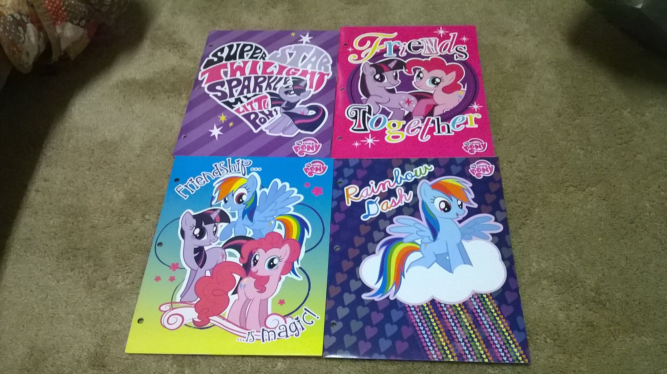
Bottom left is least interesting; bottom right’s font is poorly suited to the character; top right’s mix-n-match font is just gaudy; top left’s just kind of awkward with Twilight in a weird pose and creating too concentrated and contiguous a positive space, looks like a giant hole punched out of the background.
