Uploaded by The Smiling Pony 


.")


 - Took part in the 2020 Community Collab")


 - Celebrated Derpibooru's seventh year anniversary with friends.")

 - Celebrated Derpibooru's six year anniversary with friends.")

 - Celebrated Derpibooru's five year anniversary with friends.")


")
")


")

1657x2095 PNG 191 kB
Interested in advertising on Derpibooru? Click here for information!

Help fund the $15 daily operational cost of Derpibooru - support us financially!
Description
Words:
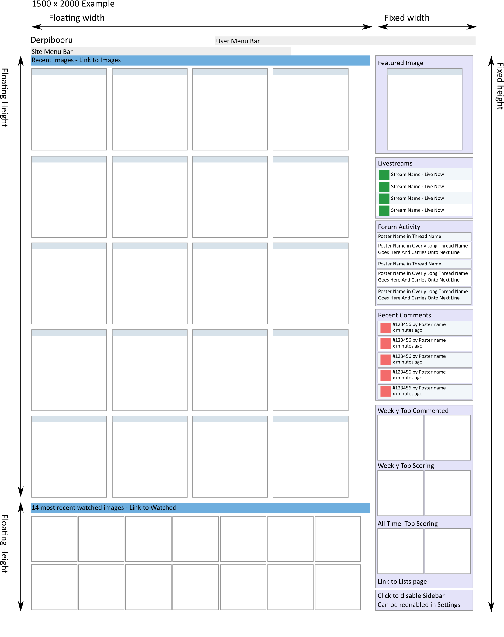
This is the latest and hopefully last mock-up for what would be the homepage/sidebar thing. Last chance to yell at me over my sheer incompetence and monumental hubris.
Notes:
Sidebar is always the same width and height.
Image grids width depends on browser window size, height depends on number of images you’re displaying.
Sections on the sidebar contain links to relevant pages/images/things.
Yes, you can disable the damn thing.
SVG for you to play with is here
Source
not provided yet
>>365912
And the search bar would be right next to the site menu bar’s buttons, matching the Recent Images bar on the bottom.
I’m trying to learn CSS and HTML so I can test it out for myself to see if it’s easy to use.
Oops! I meant more of a permanent placement, not constantly switching around. I agree that that would be confusing.
The comments and forum posts are constantly changing so they should be at the top, as they probably hold more interest.
…But whatever you do is fine…
There will be a separate Lists page showing the top 5 or whatever.
The top 2 is there so that people can know there is a lists page with this information available.
@JP
Maybe in the future…
@Keith Mowz
We´ll see how it goes. I also want to give livestreams more visibility, and as it is Forum activity would be on the “third line”, which should still be pretty visible on most monitors.
@Etherchanter
I think that could end up being a bit confusing, if on every refresh the order of entire sections starts switching around.
it removes the point of having tops , when only 2 are there…
There, now that that’s out of the way, I’d say it looks good. Nice and orderly, nothing obtrusive.
Maybe have the sidebar ordered by frequency of change with the stuff that changes more at the top? Like:
…But if this is the final form, I’m happy with it.
That’d be cool, but quite complex indeed
Anyway i probly gonna stay on the ‘image only’ home but this surely is a step fowards :D