Uploaded by Aer0 Zer0 


 - Took part in the 2020 Community Collab")


 - Celebrated Derpibooru's seventh year anniversary with friends.")


 - Celebrated Derpibooru's six year anniversary with friends.")


")


4000x1800 PNG 3.02 MB
Interested in advertising on Derpibooru? Click here for information!

Help fund the $15 daily operational cost of Derpibooru - support us financially!
Description
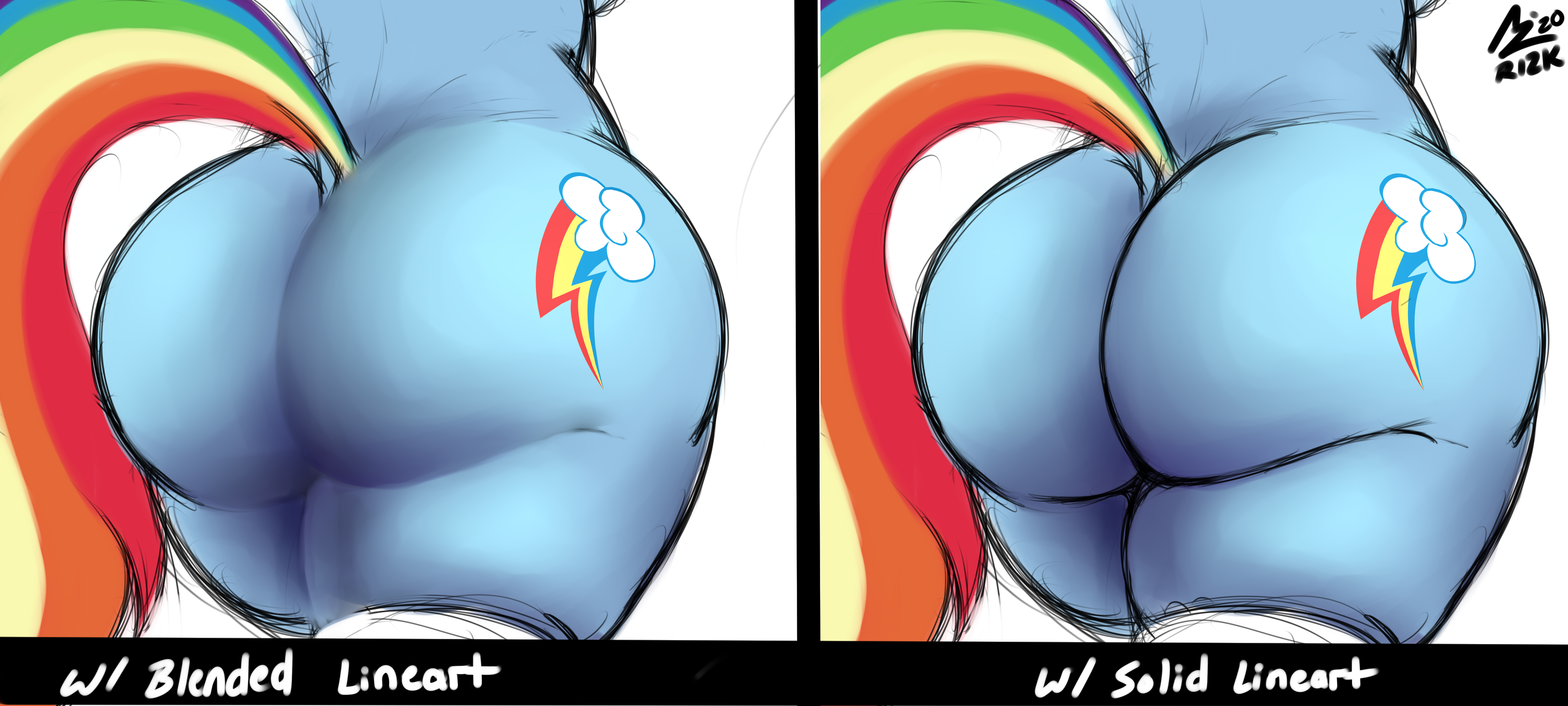
Rendering Practice
Help fund the $15 daily operational cost of Derpibooru - support us financially!
Years ago, an artist I follow on Twitter named Cubesona made a post suggesting colored outlines,
since that’s what he always does. Saying that stylizing for Black looks better than using straight Black for them.
I tried it and that’s what I’ve been doing since; using a very dark Blue instead of Black.
Edited
Gotcha! Thx for the critique and advice!
drawing a single line that is good takes FAR more effort then combine ing tons of thinner ones. You need a good grasp of line weight and where to use it thick and thin, while tons of smaller lines like this give an approximate line weight and lets you see about what you want easier.
for artist
if you want an opinion on the blended, try a bit more contrast where the lines would be, nothing that looks out of place but something that shows a line would be there more, especially because it is an ass the light source for the ass looks like it would be hitting about the cutie mark area, so there is no real reason the the inner left side of the crack would be as bright as it is.
If you want to practice lighting, try to find reference that has a singular hard light source when it comes to rendering lighting is a big thing you have to start taking into account and even a rudimentary understanding of how it works makes a night and day difference.
cant wait to see more of you stuff pretty much regardless of style you end up with.
^ This
Same.